Creator guides
Make, test, and publish better YouTube covers
Make, test, and publish better YouTube covers
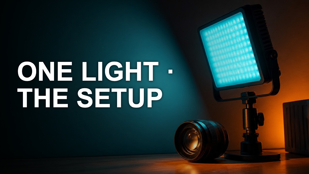
A crop should give the subject a clearer role. The best rectangle depends on the story you want to show, the text you need, and where the cover will be viewed.

A good pair gives the viewer two pieces of the same promise. Use the image to show evidence and the title to explain why it matters.
A usable palette assigns colors to jobs. Pick a background, a reading color, and one accent that still stands out after export.
Color contrast helps diagnose why a word vanishes. The ratio is most useful when you measure the colors that actually touch on the cover.
A thumbnail has to communicate before the viewer stops scrolling. Test the cover at a small width early, while the layout can still change.
Pick a layout by what the viewer needs to recognize. A familiar grid is helpful when it gives your source material the right amount of space.